---
title: "Plugins - UI toolkit"
section: "Plugins"
route: /webnavigatorpluginsuitoolkit
account: {accountId}
bruce_api: https://{accountId}.api.nextspace.host
guardian_api: https://guardian.nextspace.host
---
# Plugins - UI toolkit
PluginUi is a panel toolkit for Navigator Plugins. It draws headers, figures, lists, switches, tables, charts, legends and floating boxes in Navigator's own style, so a Plugin's panel looks like part of the app without carrying its own CSS.
The toolkit is optional and in preview. Its calls can still change between versions, so keep the copy you built against inside your Plugin rather than loading a shared one.
This article will cover adding the toolkit to a Plugin, the conventions every component follows, and a short tour of the components. The [starter kit](/webnavigatorpluginsdevenv) already includes it and uses it for its example.
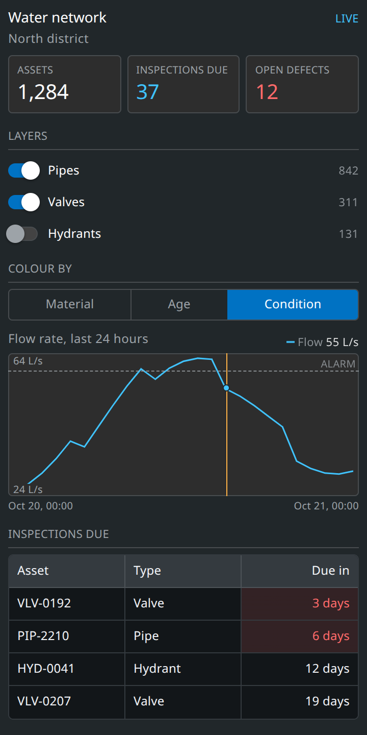
A side bar panel built with the toolkit. Each part of it is shown with its code below.
## Download
[Download UI toolkit](/res/samples/plugin-ui-toolkit.zip)
```text
plugin-ui.min.js The toolkit. Ship it inside your Plugin's ZIP, beside index.js.
plugin-ui.d.ts Types for every call, for your editor. Do not upload it.
loader.js loadPluginUi(), to copy into your Plugin's index.js.
README.md
```
## Adding it to a Plugin
1. Put plugin-ui.min.js in your plugin folder, beside index.js.
2. Copy the loadPluginUi function from loader.js into index.js.
3. Build your panel once it resolves, and dispose it when Navigator closes the Plugin.
```javascript
function Run(params) {
let ui = null;
let closed = false;
loadPluginUi({
BModels: params.pluginParams.BModels,
api: params.pluginParams.getters.GetBruceApi(),
pluginId: params.pluginId,
plugin: params.plugin
}).then((PluginUi) => {
// Navigator can close the Plugin before the toolkit has arrived.
if (closed) {
return;
}
ui = PluginUi(params.element, {
setPanelWidth: params.pluginParams.setPanelWidth
});
ui.addHeader(null, { title: "My plugin" });
});
return () => {
closed = true;
if (ui) {
ui.dispose();
}
};
}
```
loadPluginUi fetches plugin-ui.min.js from your Plugin's own ZIP, which Navigator serves at `ui.plugin/{pluginId}/file/plugin-ui.min.js`. It uses the Plugin's Version as the cache key, so a new upload loads the new copy.
For your editor to suggest the toolkit's calls, keep plugin-ui.d.ts outside the plugin folder and reference it from the top of index.js:
```javascript
///
```
## Conventions
- Every component is ui.add(parent, config) and returns a handle. A null parent means the Plugin's own element. Keep the handle, it is how you change what was drawn.
- Handles have setX to change something, isX to read a yes or no, and getX to read a value. A setter never fires the component's own change callback, so you can mirror scene state into the panel without loops.
- Passing "title" in a config wraps the component in a titled section. Add "collapsible": true to let the user fold it.
- ui.dispose() removes the toolkit's stylesheet, every floating box it made, and every timer and observer it started. Anything else your Plugin added to the scene is still yours to remove.
- Class names are generated for each mount, so two Plugins using the toolkit cannot clash, even at different versions. Every node carries a "data-ui" attribute to select on in tests and devtools.
- Colours, sizes and spacing come from the toolkit. It reads Navigator's own theme values, so a panel follows the app rather than a copy of it.
## Headers and figures
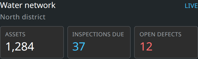
A header carries the panel's title, a short state on the right and an optional subtitle. A stat grid lays figures out in tiles. "tone" picks the colour of a figure.
```javascript
ui.addHeader(null, { title: "Water network", state: "Live", subtitle: "North district" });
const stats = ui.addStatGrid(null, { cols: 3 });
stats.addAll([
{ key: "assets", label: "Assets", value: "1,284" },
{ key: "due", label: "Inspections due", value: "37", tone: "accent" },
{ key: "defects", label: "Open defects", value: "12", tone: "error" }
]);
// Later, when the number changes.
stats.setNumber("defects", 11);
// Mutes the figures while a request is in flight.
stats.setPending(true);
```
## Switches and choices
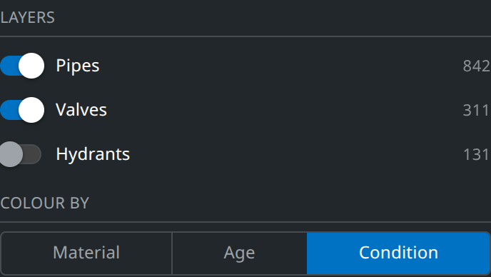
A switch list suits a set of layers the user turns on and off. A segmented control picks one of a few options.
```javascript
ui.addSwitchList(null, { title: "Layers" }).addAll([
{ id: "pipes", label: "Pipes", checked: true, badge: "842", onChange: (on) => showLayer("pipes", on) },
{ id: "valves", label: "Valves", checked: true, badge: "311", onChange: (on) => showLayer("valves", on) },
{ id: "hydrants", label: "Hydrants", checked: false, badge: "131", onChange: (on) => showLayer("hydrants", on) }
]);
ui.addSegmentedControl(null, {
title: "Colour by",
options: [
{ key: "material", label: "Material" },
{ key: "age", label: "Age" },
{ key: "condition", label: "Condition" }
],
value: "condition",
onChange: (key) => colourBy(key)
});
```
The toolkit also has radios, sliders, dropdowns, field groups, button groups, menus, popovers and modals. Their configs are in plugin-ui.d.ts.
## Charts
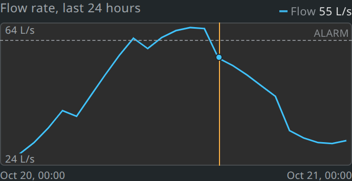
A chart draws one or more time series, with axes, a readout as the user hovers, reference lines and a marker. A missing value breaks the line rather than joining across the gap.
```javascript
const chart = ui.addChart(null, {
title: "Flow rate, last 24 hours",
height: 140,
formatValue: (v) => v.toFixed(0) + " L/s",
// Called with the time the user clicked.
onSeek: (date) => viewer.clock.currentTime = Cesium.JulianDate.fromDate(date)
});
// points is an array of { time: Date, value: number | null }.
chart.setSeries([{ name: "Flow", tone: "observed", points }]);
chart.setReference([{ value: 60, label: "Alarm", tone: "error" }]);
chart.setMarker(new Date());
```
## Tables
A table takes columns and rows, and sorts and pages them itself. Each column can format and colour its cells. For data that pages on a server, pass "load" and the table asks for each page as it is needed.
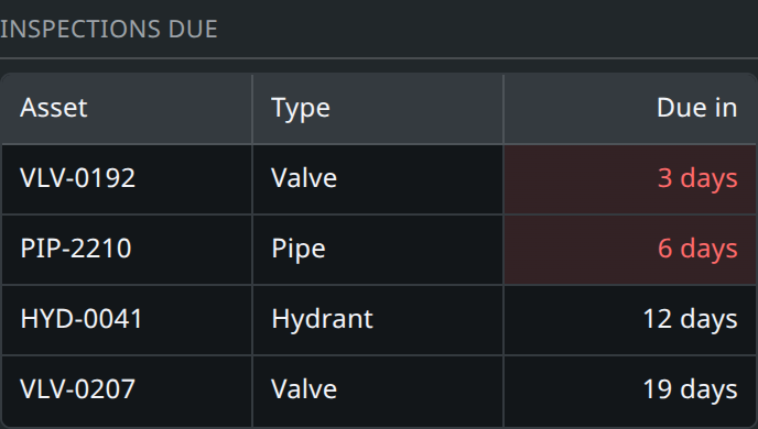
```javascript
ui.addTable(null, {
title: "Inspections due",
rowKey: "id",
columns: [
{ key: "id", label: "Asset" },
{ key: "type", label: "Type" },
{
key: "days",
label: "Due in",
align: "right",
format: (v) => v + " days",
tone: (v) => v < 7 ? "error" : null
}
],
rows: [
{ id: "VLV-0192", type: "Valve", days: 3 },
{ id: "PIP-2210", type: "Pipe", days: 6 },
{ id: "HYD-0041", type: "Hydrant", days: 12 },
{ id: "VLV-0207", type: "Valve", days: 19 }
],
onRowClick: (row) => select({ entityIds: [row.id] })
});
```
## Floating boxes
A dock is a box over the viewer, placed in one of Navigator's own corners so it sits beside the compass or under the cursor bar instead of covering them. It is how a cursor bar or background Plugin gets a panel, and it suits a legend for what a side bar Plugin draws.
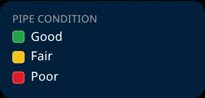
```javascript
// anchor is one of "top-left", "top-right", "bottom-right", "top-center" or "bottom-center".
const box = ui.addDock(null, { anchor: "bottom-right", width: 200 });
ui.addLegend(box.body).add({
type: "swatches",
label: "Pipe condition",
classes: [
{ color: "#24a148", label: "Good" },
{ color: "#f1c21b", label: "Fair" },
{ color: "#da1e28", label: "Poor" }
]
});
```
A dock is removed by `ui.dispose()` along with the rest of the panel.
## Themes and size
The default theme is Navigator's: a dark panel with light popovers and modals. Pass "theme" when mounting to choose "dark" or "light" throughout, or on any one component to pin it and everything inside it.
```javascript
const ui = PluginUi(params.element, { theme: "light" });
ui.addTable(null, { theme: "dark", columns, rows });
ui.setTheme("default");
// Scales the panel and its floating boxes, for very large screens.
ui.setScale(1.5);
```
## Full reference
plugin-ui.d.ts in the download lists every component, its config and its handle, with a comment on each field. With it referenced from index.js your editor shows the same thing as you type. You can read about testing a panel built with the toolkit in [Plugins: Development](/webnavigatorpluginsdevenv#webnavigatorpluginsdevenvtest).
---
Urls on this page are resolved for account `{accountId}`.
Site index: https://docs.nextspace.host/llms.txt · whole site in one file: https://docs.nextspace.host/llms-full.txt
Human-readable version of this page: https://docs.nextspace.host/webnavigatorpluginsuitoolkit